How Chattanooga Created Its Own Font to Spur Urban Growth
Like products, cities need a brand identity. In this Tennessee city, a team of designers have created an official font
/https://tf-cmsv2-smithsonianmag-media.s3.amazonaws.com/accounts/headshot/sarah-rich-240.jpg)
/https://tf-cmsv2-smithsonianmag-media.s3.amazonaws.com/filer/20120829100015chatbadge_470.jpg)
Some cities have historical legacies or famous features that give them a clear identity in people’s minds. But most have to work at it. And while a city is a much more complex entity than a corporation, the process of bestowing a metropolis with a recognizable identity is much like branding a consumer good. Cities need to sell themselves, too. Logos and typefaces are a good place to start.
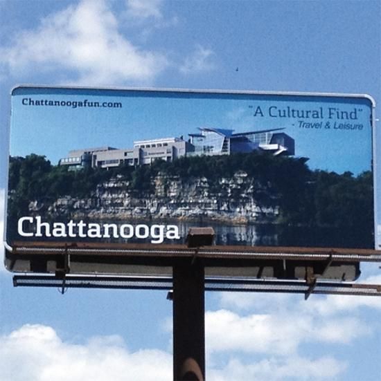
In Chattanooga, a team of young graphic designers decided to take it upon themselves to give their city a font that could be used for all Chattanooga-related communication and messaging. With recent investment in cutting-edge broadband infrastructure, the city is on an upswing, aiming to attract entrepreneurs and artists who can bring vitality to the local economy and add new layers to the city’s cultural life. There have been relocation incentives to encourage homeownership, venture initiatives to accelerate start-up culture, hyperlocal news efforts, and now Chattanooga can promote all of its efforts with one unified style called Chatype.
This was not a municipal commission. The designers—Robbie de Villiers, Jeremy Dooley, DJ Trischler, and Jonathan Mansfield—decided to make the type, then allow the city to see its potential merits. “It occurred to me that this was best done as a grassroots effort using Kickstarter,” says Dooley, “We could avoid the politics of using taxpayer money for a project like this and thus, no one was compelled to support something they may not approve of.”
Fortunately, they have found that most taxpayers heartily approve. After raising $11,476 through crowdfunding, the team completed the project and released the font on August 15. Already, says Dooley, “the visitors bureau is using it for an ad campaign throughout the South to publicize the city, and the library system has comprehensively re-branded <wbr/>themselves with the font.”
So how does a designer create lettering that represents the spirit of a city? By looking at the forms and structures that have characterized the place through time. “Originally, the city was settled by the Cherokee,” Dooley says, “The Cherokee Syllabary is based on Latin and has a lot of really cool little visual quirks.” Chattanooga’s industrial history was the reason for their selection of a slab serif—a chunky text style with a modern and subtly western line. They also wanted the font to suggest a forward-looking perspective, “reflecting the technological power that Chattanooga hopes to be with its investment in broadband infrastructure.”
Since Chatype was released, it has been picked up by numerous institutions and designers around the city. The only legal stipulation is that the font must be used only for projects directly related to Chattanooga. The designers have heard from people in other cities saying that they want a font for their own home town, but Dooley thinks at this point, Chattanooga is uniquely positioned to pull this sort of project off. “I think it’d be very difficult for other cities to do a project like this,” he says, “You would have to have a very unique mayor or city council that would understand the importance of supporting the development of a typeface family for the city. Chattanooga is exactly the right size, and we’re able to rally the local designers to provide us the support to make this a reality.” But in the long term, Dooley predicts the concept will spread. “Every city needs a brand, and every one will eventually have one. That requires type.”
/https://tf-cmsv2-smithsonianmag-media.s3.amazonaws.com/accounts/headshot/sarah-rich-240.jpg)