This One Picture Shows How We’re Causing Climate Change
Atmospheric greenhouse concentrations are going up. But where do those gases come from?

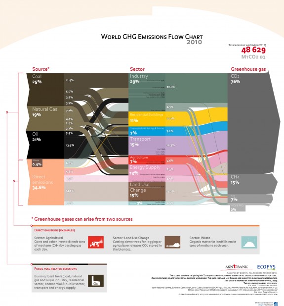
This chart showing the sources and types of greenhouse gases can be read more easily here, on this full-resolution pdf. Photo: Ecofys
We know that the atmospheric concentration of carbon dioxide is hitting levels unprecedented in human history, and we know that we’re behind it. We know that the choices we make every day, and the choices of nations, affect the emissions of greenhouse gases.
But despite knowing all this, it’s still sort of tricky to understand where all these heat-trapping molecules are really coming from. Put together by the renewable energy consultancy firm Ecofys, this infographic (high-resolution PDF here) tries to break those systems down.
The chart is kind of messy to read, but here’s how it works:
The total greenhouse gas emission rate for 2010, the year represented by the chart, is 48,629 million tones of carbon dioxide equivalent. (Methane traps more heat than carbon dioxide, so less methane is worth more in terms of driving global warming than the same amount of carbon dioxide. Hence the use of carbon dioxide equivalents.) The left side shows the main sources of those greenhouse gases: coal, natural gas, etc. Following the lines from left to right shows how we use each source: for industrial uses, for construction, for agriculture, and which greenhouse gases these industries put out.
We can see what changes to oil prices or availability would predominantly affect the transportation industry, while landlords and building managers care more about coal and natural gas. It’s not a great look at how your individual habits affect climate change, but ultimately, every one of us is contributing to the system mapped out here.
More from Smithsonian.com:
A Friendly Reminder From Pretty Much Every Climate Scientist in the World: Climate Change Is Real
/https://tf-cmsv2-smithsonianmag-media.s3.amazonaws.com/accounts/headshot/smartnews-colin-schultz-240.jpg)
/https://tf-cmsv2-smithsonianmag-media.s3.amazonaws.com/accounts/headshot/smartnews-colin-schultz-240.jpg)